November 24, 2015 Interior Design

Google is the company’s top-class world, the office many, spread all over the world. The office was nice, one of them like this, Office in London, with vivid office interior design.
According to Freshome:
All Google offices around the world can be characterized by originality and out-of-the-box staff interaction ideas. This particular project was developed by architecture firm Scott Brownrigg and is located in London. As seen on Dezeen, the total space of the office is 40,000 sq ft and the theme behind the design is Brighton beach. Here are further details from Google: “Brightly coloured timber beach huts are meeting rooms and giant colourful dice accommodate individual video conference booths, original dodgem cars and traditional red telephone booths are all work spaces available to staff and visitors. Open plan workstations for all staff are mixed with a few offices, meeting rooms and open break out seating areas and support spaces for printing and IT technical support. Scott Brownrigg Interior Design has designed a fully fitted out gym/shower facility, massage and spa treatment centre, and an Asian Fusion/Sushi restaurant that is free for all staff. What a fantastic way to gain the loyalty of your employees!
Read more…
October 5, 2015 Apartment, Interior Design
These are photo of office interior design was designed by Stanislav Orekhov Studio.

Read more…
September 25, 2015 Interior Design

Are you looking for for your office interior, or want to make a one of room in your house to become a office room?
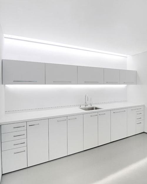
Rottet Studio has collections about it, like this Artis Capital Management Office Interior. The office was conceived as a “white box.” As the white planes peel away, the materials, textures and colors behind are revealed resulting in a “visually quiet” space which counteracts the constant visual stimulation of multiple computer screens. No walls touch the perimeter and service areas are located around the core, allowing clear views throughout the space of the entire city. Custom carpet emulates water lapping on the shore. A dark gray cleft stone surrounds the entire floor between columns to reinforce the notion of rippling tides at the water’s edge. Along the Bay side, incisions are cut into the white box in the ceiling in a pattern that emulates barges in the Bay. These incisions are carved away to reveal a warm wood material beyond and provide ambient light. The city side is more rigid and orthogonal mimicking the city’s grid pattern. The six small offices double as mini art galleries. A giant door conceals the work area and, when closed, the room is void of visual elements allowing the impressive art collection to be the feature. The lounge-style chairs with matching ottomans allow employees to retreat into their “home” and relax. Source
Read more…
August 18, 2015 Interior Design, Office Design
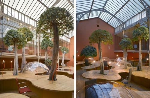
This interior design of office in Paris. Two companies Pons and Huot in Paris, France. Designed by Christian Pottgiesser.

Read more…
June 11, 2010 Interior Design
Description from Architect:
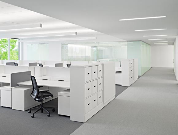
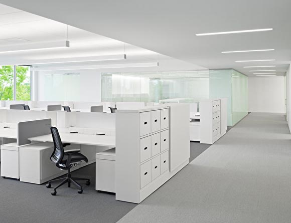
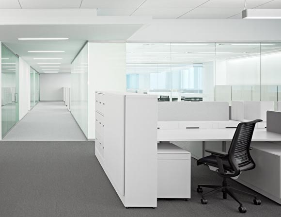
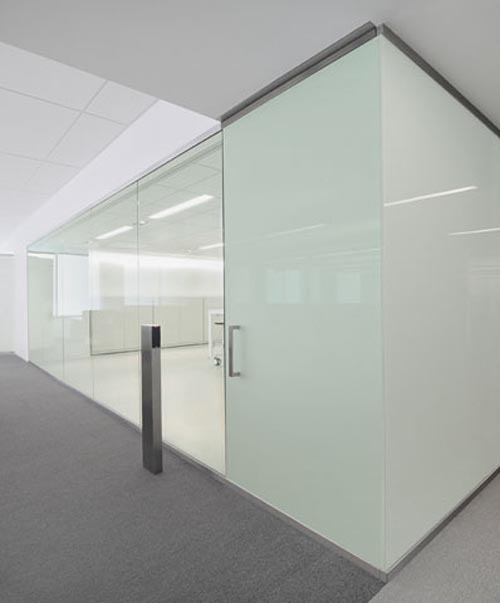
Designed for an engineering group of technology hardware company, the primary goal was to create open office areas for highly collaborative interaction and to maximize natural light. Each open area is divided by a project room that is used as meeting space, lab and product testing room. All spaces are totally transparent, yet motorized window coverings are provided to allow for flexibility and immediate privacy. Smaller meeting rooms were built along the building core, for impromptu meetings and personal privacy. Designed by Garcia Tamjidi
